Apps: Final Cut Pro 10.6 +, Motion 5.6 +, Premiere Pro 22 +, After Effects 22 +
Overview
Hawaiki AutoSplit is a versatile plug-in for split screen creation and animation.
With even more power and flexibility to help you work faster and more creatively;
And support for a wide variety of host applications, including Adobe Premiere Pro and After Effects, Apple's Motion, Final Cut Pro.
With simple-to-use menu-driven animation and fully customisable grid parameters, AutoSplit harnesses a wealth of powerful automated processes to make your split screen animation projects much easier and more enjoyable than ever before.
The plug-in comes complete with two separate effect modules:
Classic is for creating an almost limitless number of different rectangular grids in the classic split screen formation;
Extended includes a variety of shapes based on triangles that can be combined to form a large number of unusual and effective layouts.
Unlike other split screen plug-ins which offer a limited set of fixed value "boxes", AutoSplit Classic allows you to set the scale, crop and hold position of your "box" to literally any value, meaning there is virtually no limit to the different grid arrangements you can achieve. But there's also a great library of built-in presets to get you started very quickly and simply.
New in AutoSplit 1.0.4 - support for M1 (Apple silicon) Macs.
IMPORTANT NOTES: AutoSplit is designed to be used as a separate effect on separate video layers, meaning you cannot build the split screen with just one instance of the plug-in. Apply the AutoSplit effect to each of your video layers and use the scale, crop and position controls for each instance to build up the "grid" of your choice.
It is also important to note that AutoSplit expects your source image to be the same aspect ratio (thought not necessarily the same frame size) as your timeline. If you are using images with a different aspect ratio, remember to precompose, group, nest or compound them first, depending on your NLE, in order to present an image with the correct aspect ratio to the plug-in.
Presets
A really useful feature of AutoSplit is the ability to store presets for use either somewhere else in the same project, or in a completely different project, or indeed in a completely different host application. Click the "Save As" button to save the current state of all parameters within the plug-in, or use the "Open" button to load a preset you have already saved. The presets menu is also where you can access the library of built-in shapes.
Layout
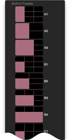
AutoSplit gives you the ability to create and adjust your layout all from within the one effect - you can use the Scale and Crop sliders to very quickly get the size and shape you want for your split screen "box" and then use the Hold position sliders to determine where you want your "box" to land in the overall layout. Or for even quicker results you can select from the built-in presets for a range of classic grid components.
In navigating the presets menu for the Classic module, it is helpful to know that the presets beginning with "A" are all the full height of the screen, the B's are two thirds height, the C's are half height, and the D's are one third height. Similarly the numbers indicate the width of the preset - the 1's are one third width, the 2's are half width, the 3's are two thirds width and the 4's are full width. Hence the preset labeled A1 is the full height of the screen and one third of the width. Note that the Classic presets are fully editable if you need to modify them at any stage - and of course, you can save off your own versions of them using the presets save function.
The real power of AutoSplit comes from the fact that wherever you decide to have your "box" land within the screen, the plug-in will automatically calculate how far it needs to travel so that it enters and leaves the screen at exactly the right frame, regardless of its size or crop - all without any effort on your part. If you decide on a different box position, the new trajectory is recalculated instantly without you having to touch a single extra control.
Note that the Extended module does not include the option to crop, scale or position the shape - all you do here is select your preferred shapes from the dropdown menu and position them using the flip, flop and flip-flop menu in order to assemble your grid.
This makes for a very flexible way of working, meaning you can experiment and change your mind at any time to reconfigure your grid any way you want it.
Snap to Thirds
Because the AutoSplit controls work in floating point (decimals) rather than fractions, you could run into difficulties trying to set values of 1/3 and 2/3 for any of the scale, crop, or position sliders, given that the true value ought to be 0.3333… or 0.6666… and an insufficiently precise value could lead to visibly incorrect alignment of the grid.
For this reason there is a Snap to Thirds button at the top of the interface. Any value you enter between 0.3 and 0.3333… or 0.6 and 0.6666… will automatically snap to precisely 1/3 or 2/3, making your life a whole lot easier.
If you want to over-ride this behavior, simply toggle off the switch. You might for example want a grid where you divided the screen into precisely 0.3 and 0.7 along the horizontal axis, and the snap behavior would interfere with your plan. In most cases though you will want to leave it on.
Scale
Scale - Use the Scale Slider to choose an overall size for your “box”. A value of 1.0 means that your “box” will be the full height and width of the screen (or less depending on your choice of Crop values (see below). A value of 0.5 will give you a "box” that is half the height and half the width of the screen, and so on.
If you want a box that is 1/3 or 2/3 of the full screen size, all you have to do is enter a value of 0.3 or 0.6 respectively, or simply drag the slider close to the required value and Snap to Thirds will automatically set the precise value for you.
Using the Scale slider alone will of course only give you a “box” that has the same aspect ratio as your project, but what if you wanted a “box” that was, for example, the full width of the screen but only half the height? Well, that’s where the Crop Adjuster sliders come into play.
Crop
Use the X and Y Crop Adjuster sliders to refine your "box" dimensions and/or aspect ratio, if required. The X Crop slider affects the left and right (horizontal) crop, while the Y Crop slider affects the up and down (vertical) crop. A value of zero (the default) for either slider means the “box” is not being cropped, whereas a value of 0.5 means that you are reducing the width (or height) by 50%.
If you want a crop that is 1/3 or 2/3 of the full width or height, all you have to do is enter a value of 0.3 or 0.6 respectively, or simply drag the slider close to the required value and Snap to Thirds will automatically set the precise value for you.
Remember that the actual resulting size of the “box” will depend on what value you have chosen for the Scale slider. If you choose a Scale value of 0.5 and an X Crop value of 0.5 you will have a box that is 25% (a quarter) of the width of the screen, and so on.
Scale vs. Crop - Because of this flexibility you can achieve some layout types in two different ways. For example, using the a Scale value of 1.0 with a value of 0.5 for both the X & Y Crops gives you the same "box" as if you had simply chosen a Scale value of 0.5 with a value of zero for the 100% X & Y Crops.
The difference is that the image inside the box would be scaled differently in each case, with a larger cropped picture in the first case and a 100% scaled picture in the second. But because you can also scale and reframe the image inside the "box" (see below), you could end up with the same result using either approach. And that means lots of flexibility and more speed in setting up different options.
Hold
The X and Y Hold position sliders are what enable you to line up the separate “boxes” of your “grid” just the way you want them.
The default values of zero for both X and Y position mean that the “box” defaults to sitting at the bottom left hand corner of the screen once it has completed its Arrive (incoming) animation (if any). A value of 1.0 for the X Hold Position slider will sit the “box” at the extreme left hand edge of the screen and a value of 1.0 for the Y Hold Position slider will sit it at the top edge of the screen.
From this you can easily work out that a value of 1.0 for both X and Y will sit the “box” at the top right hand corner of the screen, while a value of 0.5 for both will sit it in the dead center of the screen. If your layout has "four boxes" across, you will need to sit the middle two at 0.3333… and 0.6666… respectively, and this of course is where Snap to Thirds comes in very handy.
TIP - When you apply the effect to all your video layers at once you will of course find that they are all sitting on top of each other in the exact same position at the bottom left hand corner, and you might find this confusing. If this is the case, you can try using your NLE’s visibility enable/disable function to hide the layers you are not currently working on.
NOTE: Animating the Hold position values is possible but not desirable if you have an outgoing (Depart) animation set up as it could interfere with the built-in animation co-ordinates.
Pan & Scan
Depending on how you have scaled and cropped your layout "box", you may want to reframe your image inside the "box" and this is where the Pan & Scan section comes in. (Note that Snap to Thirds does not apply to these values.)
Image Scaling - Resize your image using the Image Scaling control - a value of 0.5 reduces the scale by half and a value of 2.0 doubles it. Do be aware that image scaling values above 1.0 will result in progressing softening of the image which might be undesirable.
Remember that you may well want to choose different scaling values depending on whether or not you have cropped the "box".
Image Offset - Reposition your image to get just the framing you want with the Image X & Y Offset controls. Be careful not to adjust the sliders too far - if you don't have enough available picture you'll end up with empty space within your "box".
The Pan & Scan controls can of course be keyframed if you want to create a dynamic resize or reposition of your image inside its "box".
Arrive & Depart
The speed and direction of the incoming (Arrive) and outgoing (Depart) animations, as well as their fades, are driven by a few simple controls.
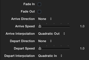
Enable either of the fade checkboxes if you would like your image to fade in and/or out. This function works whether or not you are animating the position Arrive or Depart. The default values give no fades. The timing of the fades will match the Arrive and Depart speed values respectively.
Arrive/Depart Direction - Choose where you want your “box” to arrive from (the incoming animation) and depart to (the outgoing animation) using the Arrive/Depart drop-down menus, allowing for quick and easy set-up and adjustment of your animation.
The available options are: Left, Top Left, Top, Top Right, Right, Bottom Right, Bottom, Bottom Left. The default None option leaves the “box” in place and applies no animation. You can of course choose a different animation option for the arrive and depart phases, so for example your “box” could arrive from the right and depart to the top.
Speed - Adjust the Arrive/Depart speed sliders to speed up or slow down the time it takes for the “box” to arrive or depart (as well as the duration of the fades, if any). The Arrive/Depart speed is measured in seconds, so a value of 1.5 for the Arrive Speed would result in the "box" taking one and a half seconds to reach its hold position.
The default speed is 1.0 seconds. How many frames that actually is will of course depend on the frame rate of your timeline.
Interpolation - One of the many great features of AutoSplit is that you can fine tune the animation curve with a lot of precision.
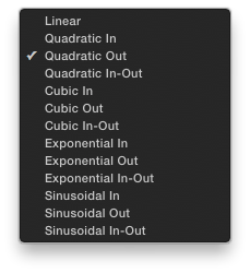
Both Arrive and Depart have separate Interpolation menus so you can adjust the movement very precisely to your individual taste. The default Quadratic Out behaviour for the Arrive and Quadratic In for the Depart will give you a gentle and elegant ease in for the Arrive phase and an ease out for the Depart phase. But you can choose from a wide variety of options including the straight Linear option, Quadratic In, Quadratic Out, Quadratic In-Out, Cubic In, Cubic Out, Cubic In-Out, Exponential In, Exponential Out, Exponential In-Out, Sinusoidal In, Sinusoidal Out, and Sinusoidal In-Out.
Experiment to see what works best for you.
Border
AutoSplit gives you a lot of control over the look of the edges and corners of your split screen "boxes". Let's look at the border first.
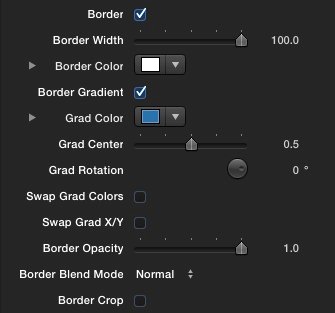
Choose your Border Width, Color and Opacity using the corresponding controls.
You can also check the Border Gradient box to enable a two-color gradient fill rather than the default solid color. When the Gradient option is selected the Gradient Color swatch becomes operative, along with the Gradient Center and the Gradient Rotation controls. The Border Color swatch will define the lower of the two gradient colors and the Gradient color swatch will define the upper color. Use the Gradient Center slider to adjust the vertical offset of the gradient. Use the Gradient Rotation wheel to adjust the angle of the gradient.
You can swap the order of the gradient colors using the Swap Grad Colors checkbox - which means that the Border Color will appear where the Gradient Color was and vice versa. You can also swap the direction of the gradient from vertical to horizontal using the Swap Grad X/Y checkbox. These extra controls really speed up the gradient design process and allow to quickly try out different options.
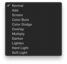
Use the Border Blend Mode menu to create interesting border looks. All will produce great effects depending on your chosen border colour. Choose from Normal (Source Over), Add, Screen, Color Burn, Color Dodge, Overlay, Multiply, Darken, Lighten, Hard Light, and Soft Light.
Depending on whether or not you want to see the outside edges of your border, you can select or deselect the Border Crop checkbox. The default mode (Off) means you will be able to see the border edges all the way around, while the On mode means that the outside border edges will be hidden off the edge of the screen. It's usually a good idea to set this value to be same for each of the layers of your split screen composite.
TIP - It is best to try and set the border values the same for each of the layers in your split screen - in particular, it's very important to use the same Border Width value when you are in Border Crop On mode otherwise you'll see unsightly gaps opening up between the separate "boxes". In fact, a good way of working is to start by setting up the look for your first layer and once you're happy copying the effect to your other layers, changing the remaining parameters as necessary. This is usually going to be quicker than having to change a lot of border parameters for more than one layer. Don't forget that you can use the Presets option to save border looks that you might want to re-use.
Corners
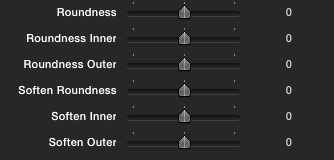
Corners - You can control the roundness of your corners with the Roundness, Roundness Inner, and Roundness Outer controls. The Roundness slider is a master control that affects both inner and outer roundness in a linked fashion, but you can use the other two sliders to vary the amount for the inner and outer corners separately. This very easily gives you huge amounts of control over the look of your corners for some really cool-looking effects.
Some very interesting effects can be achieved using the Inner and Outer Border Softness controls, especially when these are combined with some of the more unusual Border Blend Modes. Try this example. Turn off Border Crop. Set the Border Width to 30 and choose a slivery blue/grey Border Color. Set the Border Blend Mode to Add. Turn on Linked Roundness and set the Roundness Inner value to 20. Finally set the Border Softness Outer value to 20. The result is a soft shiny bevel with a nice crisp inner edge.
Note that Corner Roundness is not available in the Extended module, while Softmess is only available for the inner edge of the border.
Motion Blur
Motion Blur - If you want to smooth the motion of your animation, use the dropdown menu to select a motion blur value. The default is Off, but you can choose from Low, Medium or High. Be aware that Motion Blur will increase your render times and slow real-time performance so only use it as needed.
Extended Module
The operation of the Extended Module is slightly different from the Classic module. The main difference is that instead of setting up the shapes yourself, you will be selecting from a library of prebuilt shapes with more or less predefined positions.
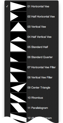
There are 17 shapes in the library which you can access via the Shape Type menu at the top of the interface (or in the case of Final Cut Pro, via the onscreen menu button as well as the Inspector). This shows you a thumbnail of each shape making it easy to pick what you need to make your "grid". The shapes interlock in a variety of possible ways from the obvious to the not so obvious, allowing for a very large number of possible "grid" options.
Each shape can be horizontally flopped, vertically flipped, or both, using the the Horizontal Flop and Vertical Flip checkboxes. Of course, depending on the shape, flopping or flipping may have no effect due to symmetry. Where a shape has one axis of symmetry either on X or Y only one transformation is possible - thus Alt Half Diamond, Half Horizontal Vee, Horizontal Vee can only be flopped horizontally, while Half Diamond, Half Vertical Vee and Vertical Vee can only be flipped vertically. Diamond cannot be either flipped or flopped.
From this you can work out that the library of 17 shapes will in fact give you 55 shapes when all the possible transformations have been taken into account. Of course, the number of possible "grids" you can derive from these building blocks is large as well - we'll leave it to you to do the math because there are bound to be some options even we haven't thought of.
Let's take a simple three-layer example, select Horizontal Vee for one of your layers and Horizontal Vee Filler for the other two. Let's flop the Horizontal Vee so its "arrow" points right to left. Then lets do a Vertical Flip on one of the two Horizontal Vee fillers to move it to the top left corner of the screen. And that's a completed fullscreen grid.
The flipping and flopping may take a bit of getting used to if you're not familiar with the concept but once you're up to speed it really makes for a very quick way of working - and lots of extra possibilities. Think of it as a very easy form of Tetris!
Grid Design
With a bit of imagination you can create some really interesting "grids" to make your project really stand out.
Bear in mind with both Classic and Extended that you don't necessarily have to fill the entire screen with your "grid" - you could for example have just two or three "boxes" and/or shapes over an interesting background.
And there's no reason why their edges have to line up - a funky overlap could be just the thing to create a stand-out design.
Looked at like this AutoSplit is a really powerful and easy to use picture-in-picture tool in addition to being the best split screen animation plug-in you can buy.
When designing your animations, it's sometimes preferable to have all the layers arrive at the same time, but very often you can create a much more pleasing effect by offsetting the starts and ends of each layer slightly for a more organic look.
Again you might want to consider having your boxes cross over each other as they arrive and/or depart, which also adds interest - so for example have the box that's going to sit in the top left corner arrive from the right, and the box in the top right corner arrive from the left. Another way of adding a bit of extra flair is to use different blends modes for the layer (Add, Screen, Overlay, etc.) so you get a pleasing look as the images overlap and blend together.
When working with borders, consider compositing your split screen over a background that is the same color as the border - especially when used with white borders this can give a really nice clean, fresh and modern look.
We really hope you are going to enjoy using AutoSplit and seeing just how far you can go with it.