Hawaiki Style is the new graphic design plug-in for FCP X that allows you to instantly style text and logos for an incredible variety of great-looking professional results.
Hawaiki Style comes complete with 75 stunning preset looks that you can simply drag and drop for great first time results, or you can customise any of the looks in any way you want, or create your own awesome style from scratch.
With 5 different style modes to choose from and an amazingly versatile set of tools available in each, Hawaiki Style brings you bevels, custom contours, outlines, inner and outer strokes, inner and outer glow, drop shadow, texture overlays, erosion and much more.
Fill presets under each category give you rich and detailed instant results or you can create your own custom colors or gradients if you prefer.
And with auto-animated edge and face lighting, creating a unique and impressive style couldn't be simpler.
No other style package gives you anything like this much choice and creative freedom while still being incredibly easy to use.
OPERATION OVERVIEW
Basic Operation - You can find Hawaiki Style in your FCP X Effects Browser, with the 75 preset looks arranged by design category. These include: Chrome, Distressed, Metallic, Outline, Shiny, Stone, Stylised, Synthetic, and Ultra Bevel. Simply drag any preset onto a title or logo in your timeline for an instant result, or hover over any style to see a realtime preview of the result. When you have applied the effect, you can use the controls in the Inspector to customise the look. Every preset is built on the same basic foundation, so you can modify anything you want if you simply prefer to take the preset as a starting point for your own design.
Recommended Practice - Note that Hawaiki Style is calibrated to give great results with "display text" such as main titles, featured text, and large captions. It will also work really well with featured logos that fill a large proportion of the screen.
Of course you can just as easily use it with smaller text or artwork but you might find that applying the effect (or auditioning it via the preview function) doesn't look quite right because the defaults have been calibrated to work at a larger size than you are using.
We strongly recommend that when setting up a style, you start by making your text or artwork as big as you can in the available screen area, especially if you are working with text or artwork with lots of fine detail. Once you are happy with the style, you can use either the effect's built-in transform tools, or the Transform option in the FCP X Inspector, to reduce it to its final size. (Don't try to move the text itself as this will change the resulting look - always use the transform tools [see below].) This will ensure that you get the most detail out of your design.
We also recommend that you center up your text or artwork vertically within the screen when setting up the design - the FCP X dynamic guides are really handy here. The reason for this that your text or artwork is actually just a cutout or window onto the background gradients and/or texture maps provided by Hawaiki Style. Vertical centering means that you will get the benefit of the gradients and other textures as they have been designed. As you move your text or artwork around the canvas you will see that you are sampling a different region of the gradient or texture - you can of course use this for creative effect, but maybe wait until you get familiar with the Hawaiki Style before you start going crazy with this kind of thing!
This is also the reason why we recommend using the built-in or FCP X Transform tools to reposition and/or rescale your finished design - moving the text layer itself will change the design, which is usually not what you want.
If you don't want to do this and you prefer to work at a smaller size, you can of course, simply scale back the values for the relevant controls but it's not the ideal way of working and it can be hard to see exactly what you're doing unless you have a really big monitor. If you do choose to scale up your text or artwork, make sure you don't make it larger than the available screen area as the result will be cropped when you reduce it.
For the reasons discussed here, there limitations to using Hawaki Style with rolling or crawling titles. Gradients and image maps will look like reflections rather than textures that move with the text, and erosion will not look right at all. If you do want to use Hawaki Style in this way, we recommend turning all gradients to solid fills and avoiding the use of textures, except where these are appropriate to use as reflections, as for example with the Sky texture option.
Check your Aspect Ratio - One really important thing you need to be aware of is that FCP X expects to see a source image that is the same aspect ratio as the timeline in order to apply this kind of effect correctly. If you add the effect to a source image that is of a different aspect ratio to your timeline, you may well see the result getting cropped, even if you have set the spatial conform to fit the screen. In this instance, always make a compound clip of your artwork before applying the effect. This ensures that FCP X is presented with the aspect ratio that it is expecting and will avoid any unpleasant surprises.
Alpha Channel - You can apply the effect either to a title you have made with the FCP X Title tool, or to a piece of artwork (text or logo) that you have imported. If you are using imported artwork, you need to make sure you have an alpha channel to take care of the transparency.
If your artwork doesn't have an alpha channel, you can usually get round this by first applying the FCP X Keyer or Luma Key to derive an alpha channel and the adding Hawaiki Style on top of that.
STYLE SELECTOR & CONTROLS
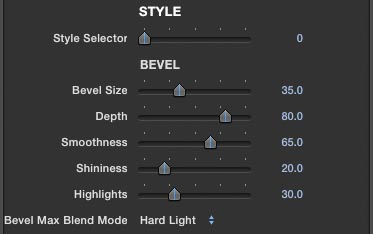
Style Selector - Hawaiki Style comes with 5 built-in contour styles and these can be accessed by using the style selector slider at the top of the Inspector: Bevel (0), Bevel Max (1), Double Bevel (2), Plastic (3) and Flat (4). The first four each provide a different "3D" contour, while Flat, as the name implies, has no contour. As you change from one style to another, the available controls will update to show you only the ones that are relevant to that particular style.
Please note however that changing the Style in this way may not always result in something that looks great - the presets have been optimised for specific styles and might not transfer well to a different style without a bit of extra tweaking.
Bevel and Bevel Max both have the following five contour controls, which are not available when flat is selected: Bevel Size, Depth, Smoothness, Shininess and Highlights. Plastic has the same additional controls with the exception of the Bevel Size control. Double Bevel has the same controls as Plastic, plus four additional controls: Bevel Inner, Bevel Outer, Face Sculpt and Amount. Bevel Max has three additional contour controls: Erode, Facet and Amount. Bevel Max has an additional dropdown menu (always visible) that allows you to select the blend mode for this style, but this blend mode menu has no effect on the other styles.
Styles - Bevel is a standard simple bevel. Bevel Max is a more complex and interesting looking bevel option that gives greater control over the contouring. Double Bevel is a more intricate bevel option with control over an inner and outer bevel for some really unusual and effective results. Plastic, as the name implies, gives a plastic-looking rounded look. Flat is a great choice for when no contouring is required but you still want to take advantage of all the other styling options within the effect.
Bevel Size - The bevel size control increases the width of the bevel. But as with all things in life, remember that more is not always better. How far you can increase the bevel size is going to depend on the detail of your text or logo. If you have a very small or thin font, or a logo with areas of very fine detail, increasing the bevel too far will cause it to collapse and potentially look ugly. So use your skill and judgement. When using Bevel Max, you'll find that Bevel size is a lot less important than you think, since other factors are creating the more complex wider looking bevel. (In fact, you can reduce the Bevel size to zero and still get an impressive bevel effect with Bevel Max.) For this reason, it's a better choice if you want a really wide looking effect.
Depth - The Depth controls affects the apparent depth (or height, if you prefer) of the "3D" effect, making for deeper shadows areas. As with bevel size, use your judgement and don't push it too far as it can adversely affect the look in some cases
Smoothness - The Smoothness control rounds off the edges of the bevel operation for a smoother result. Again, and sorry if we're repeating ourselves, very high smoothness values might not work with your text or artwork so use just enough and no more.
Shininess - The Shininess control increases the apparent specularity (or shininess) of the result. The higher the value, the more burnt out it will look. Again a lot of shininess is less interesting than just the right amount (or less). Note that higher values will also make the result look less saturated.
Highlights - The Highlights control isolates the brighter parts of the shine. It's a good idea to use this in conjunction with the Shininess control to play one off against the other - for example, a low Shininess value with a high Highlights value gives a more interesting result than a high Shininess value on its own. A high value for both is not usually going to be a particularly good look. Again, it's all about your skill and judgement.
Erode & Facet - These two controls, available only in Bevel Max, allow you to make adjustments to the contour profile for that style. Increasing the Erode value shrinks the face detail and increases the apparent width of the bevel. The Facet control increases the sharpness of the result making for a more defined looking bevel. It is worth adjusting both of these together to get the most out of the effect.
Bevel Max Amount - The Bevel Max Amount slider (default 50%) allows you to increase or decrease the contribution of the Max component. Reducing the value to zero gets you back to a Standard bevel, at which point Erode and Facet will have no effect.
Bevel Inner/Outer - These two controls, available only in Double Bevel mode, affect the contour profile for the effect. The essence of Double Bevel is that it allows for an extra layer of bevelling that is set in from the edge. Increasing the Bevel Inner value will shrink the inner raised section - in fact, you can shrink it right down to nothing for an interesting effect where the surface looks as though it is scooped out rather than raised up. The Outer Bevel affects the bevel at the edge of the shape. It's hard to describe exactly how they work so you're advised to just try them out and get a feel for them - again it's a good idea to adjust both these controls together to see what you can do with them, as their interaction is often what makes the effect interesting.
Face Sculpt - This control, available only in Double Bevel mode, allows to to choose whether the Face Fill does or does not affect the bevel contour. This is particularly useful if your Face Fill is a complex gradient - sometimes it's really effective to allow the gradient to influence the contour, but at other times you might not want this behavior. In that case, reduce the value of the slider until you get the look you want, all the way to zero (thed default) if necesary.
Double Bevel Amount - Reducing this value will gradually return the look back to a plain bevel. It's a good idea to use this control if you're double bevel is looking too "crunchy" or aliased, which can happen if you really push the values. Dialling back on the amount a little can take care of this, while still preserving the overall look.
Plastic - When using Plastic, there is no Bevel size control as the look is based on a fully rounded profile. However you can adjust the contour using both the Depth and Smoothness controls - again, it's worth experimenting with adjusting both of these as their effect is inter-related.
All the remaining controls apply equally to all five modes.
COLOR
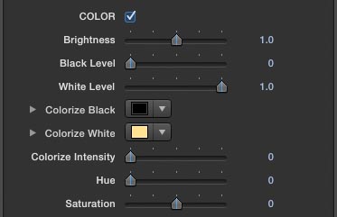
Color - this section of controls provides really quick and easy adjustment of the look of your effect, with controls for Brightness, Black Level, White Level, Colorize Black and White and Colorize Intensity, Hue and Saturation.
Use the Brightness control for a very simple adjustment to the overall brightness of the effect. Use the Black Level control to increase the weight of the blacks and reduce the White Level to increase the strength of the whites. Using both controls will increase the overall contrast.
Colorize is useful if you want a different way of adjusting the overall color but it does have the side effect of making the whites less white. The Hue control is a slider calibrated from zero to 360 degrees that allows you to rotate the hue of the overall effect for a very quick and easy way of adjusting the color without having to dive into any of the individual color settings. Use the Saturation slider to increase or decrease the intensity of the overall color.
FACE
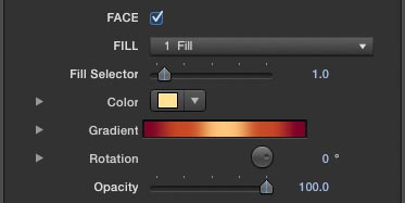
Face - The Face section is where you can set the basic overall color or gradient colors for the effect. (You can toggle the Face switch to turn the entire face on or off, if you like.)
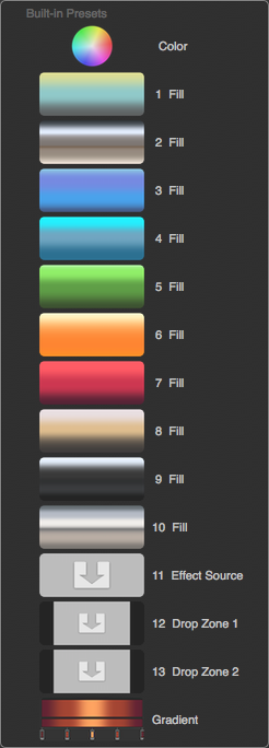
Face Fill Menu - To make life really easy, we've supplied a set of built-in color styles for the fill which you can access via the FILL dropdown menu or by using the Fill Selector slider. There are 10 preset fill styles, but you can also select Color, which enables the Color swatch if you want a solid color fill; or you can select Effect Source if you want to keep the colors of an original artwork image such as a company logo; you can select from two different Drop Zones if you want to add a texture or gradient to use here; or you can select Gradient which enables the Gradient generator where you can design your own gradient fill.
Gradient - the controls for this are the standard Apple Motion/FCP X gradient controls. Twirl open the Gradient to access them. The first thing you will see is a set of two bars each with small square tabs which allow you to set values. The topmost bar sets the opacity and mostly you will want to leave this alone, while the bottom bar allows you to set the colors in the gradient. The tab on the left will set the color that appears at the top of the gradient, and the tab on the right will set the color that appears at the bottom. Clicking on the color bar allows you to set a new color tab - you can drag its position wherever you want it. To remove a color tab, just pull it away from the bar and it will disappear in a puff of smoke (nice one, Apple!). Clicking on a color tab activates its color swatch and you can make adjustments to the color. You can adjust the positioning of the gradient in relation to your text or artwork by adjusting the X and Y Start and End values. There's a lot more to the gradient controls than we can go into here so if you need more details, please consult the Apple documentation.
Preset Gradients - There are 10 preset gradient styles which give you a great-looking instant result, but these are not user-adjustable in terms of their colors. If you like the look of a gradient but you're not too sure that the color is right, try using the Color controls (see above) to adjust it to your taste. Using the Hue control is a quick way of getting a different result, or you could try Colorize.
Rotation - it is very quick and easy to rotate the gradient using the Rotation control. The default setting is for the gradient to run from top to bottom, but if you want it to run from side to side, for example, then simply adjust the rotation by 90 degrees. Often you can add interest to the look simply by adding just a few degrees of rotation.
Opacity - you can use the Opacity slider to fade out the face only leaving just the other components of the design.
OUTLINE & SHRINK
Outline Mode - this allows you to knock out the face of your text or logo and use only the outline. Because this still uses all the style functions including contour, it can make for a really great look. Enable the Outline mode checkbox to achieve this result, then adjust the Outline Size slider to taste. Again you need to remember that the outline will give you a lot less surface area to play with than when you are using the full face area, so you will need to refine your contour controls to make sure the bevel features don't collapse due to the limited surface area.
Shrink Mode - With Shrink mode you can cut away at the outer edges of the text or artwork for a "skinnier" look. Enable the Shrink mode checkbox to achieve this result, then adjust the Shrink Size slider to taste. A very handy trick if you need it.
GRADIENT CONTROLLER
Gradient Controller - the Gradient Controller allows you to affect the spread of the preset gradients (and the custom gradients: see below). Increasing the Start value will make the top of the gradient start higher up in the frame, while decreasing the End value will make the bottom of the gradient start lower in frame. Increasing the distance between these values will make for a softer blend between the gradients colors and it will also mean that you will see less of the colors at the extreme ends of the gradient. Decreasing the difference will make for a tighter gradient with sharper blends between the colors. Remember that you can also use these controls simply to shift the active section of gradient up or down - all you need to do is adjust the controls equally keeping the difference between them the same.
The Include dropdown menu allows you to determine which user-adjustable gradients are affected by the controller. The default is Presets only, which means that only the preset gradients will be controlled. If you select All, all of the preset gradients and all of the user-adjustable gradients will be affected. Alternatively you can choose to include only one of Face, Glow, Shadow, Outer or Inner Stroke, or Inner Glow user-adjustable gradients along with the preset gradients, leaving the others to be controlled by their own gradient Start and End parameters.
DETAIL
The Detail section includes the option to use a texture to create additional interest to the design, and add erosion which eats away at the text or artwork for a distressed or "grunge" look.
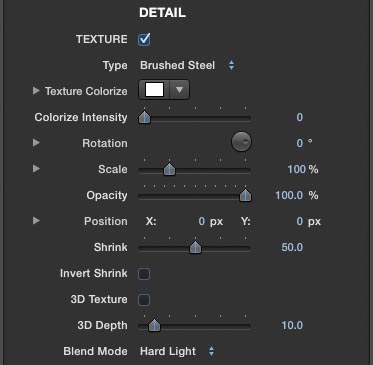
Texture - enable the texture checkbox to start using the texture option. The Texture Type menu offers a selection of built-in textures, as well as the option to choose Flat or Gradient (see below), or a texture that you have added to either of the two Drop Zones. The built-in textures include: Sky, Travertine, Slate, Marble, Rust, Metal, Brushed Steel, Industrial, Bark and Wire. Note that these are all grayscale textures and will not affect the colors of the result, but you can use the Texture Colorize swatch and Colorize Intensity slider to add a color wash to the texture fill. Note that the Sky texture is really useful as a reflection map when you want to create a super shiny look, since obviously a shiny object will reflect its environment.
Texture Controls - you can adjust the amount of the texture applied with the opacity slider and change its blend mode with the dropdown menu. Use the Scale, Rotation and Position controls to select the portion of the texture that works best for your design. Using the Fill Preview option (checkbox at the top of the Inspector), makes it easy to line up just the section you want.
Shrink - The Shrink slider allows you to determine how much of the surface area is covered by the texture. Increasing the value reduces the texture area - this is particularly useful if you don't want the texture to affect the bevel area, for example, but it also has stylistic value as we'll see below.
3D Texture & Depth - Enabling the 3D texture checkbox causes the texture itself to become extruded or raised up with the appearance of 3D, and you can adjust the apparent height of the result with the 3D Depth slider. This can give a lot of extra interest to the design but it also has another use when the Flat or Gradient texture is selected. The result is an extra layer of bevelling that can make for some really complex effects - you will need to use the Shrink slider to reduce the area being affected. On top of the main bevelled styles, it can really create some great looks.
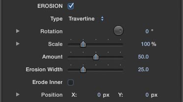
Erosion - In addition to, or instead of, using the texture option, you can enable the Erosion checkbox which allows you to use another texture to "eat away" at or erode the text or logo. The Erosion Type menu gives you access to a similar set of textures as you have in the Texture section, as well as allowing you to use either of the Drop Zones as a source for the erosion.
You can control the Rotation, Scale and Position of the erosion texture map. Use the Amount slider to adjust the intensity of the erosion, and the Erosion Width slider to eat further into the outline of the shape. Toggle the Erode Inner switch to begin the erosion from the inside of the shape and again use the Erosion Width slider to control how close you want to go to the edges of the shape.
The Erosion maps are high contrast grayscale images and if you're making your own it's best to aim for a similar treatment - whatever is completely white will be solid, and whatever is completely black will be eaten away or eroded, while values in between will be semi-transparent. (Usually you won't want to have semi-transparent areas as this can look a little odd, but you might like that effect so feel free to experiment, of course.)
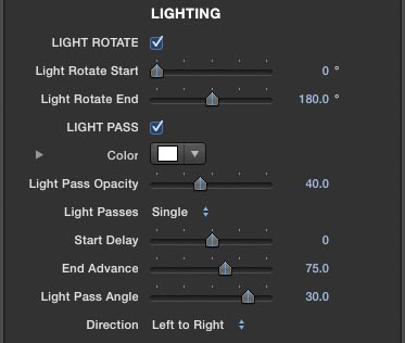
LIGHTING
One of the really powerful features of Hawaiki Style is the built-in lighting animation controls which make it really easy to add sumptuous lighting effects to your design.
There are two different types of lighting animation that you can use either together or separately: the first is an animation that rotates the lighting around the edges of the bevel, which really adds drama and interest to the 3D effect; and the second is a light pass that adds a glint (or two or three) passing across the surface.
Light Rotate - You can disable the Lighting rotation by clicking the Ligh Rotate checkbox, but the effect is on by default. Use the Light Rotate Start and End sliders to determine to amount of light rotation that wll take place. This animation will automatically last the full duration of the clip.
If you don't want any light rotation animation but you still want to control the angle of the (static) lighting, simply disable the Light Rotate checkbox and use the Light Start control to set the direction.
Note that it is not possible to rotate the lighting more than one full rotation of 360 degrees. If you want the lighting to rotate multiple times, you can achieve this by duplicating the clip.
Light Pass - Enabling the Light Pass checkbox (on by default) creates a glint that passes across the object. Use the Color swatch to set the color of the light (the default is white) and the Opacity slider (default 50%) to determine its intensity. Use the Light Passes dropdown menu to select how many passes you want - choose from Single, Double or Triple.
Start Delay/End Advance - You can determine when the Light pass begins and ends using these two sliders. By default the Light Pass begins at the start of the clip, but increasing the Start Delay will shift the start point later in time. Similarly the End Advance slider (default 75) adjust the point at which the light pass finishes. By default this is half way through the length of the clip but you can speed it up by increasing the value or slow it down by reducing it - a value of zero will mean that the light pass takes up the entire duration of the clip. Note that depending on the width of your text or logo within the screen you might find that the light pass starts later and stops earlier than you would expect - in this case simply adjust the Start and End values accordingly.
Light Pass Angle - Use the Light Feather slider to adjust the width of the light and the Light Pass Angle slider to determine whether the band of light is vertical or angled either to the left (a negative value) or to the right (a positive value).
Direction - Use the direction pop-up menu to choose whether you want the light to pass from left to right (the default) or right to left, top to bottom, or bottom to top.
EDGE
In the Edge section you can apply Inner and Outer Glow, Drop Shadow, and Inner and Outer Stroke.
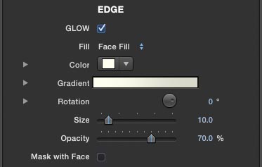
Glow - Enable the Glow checkbox to turn on the Outer Glow effect. Note that if you are using the FCP X Text tool, the built-in FCP X Title Glow won't work, which is why it's really useful to be able to add one with this option. Use the Fill dropdown menu to determine the look of the glow - you can select from Face Fill (which uses the current Face Fill selection, see above), Color (which enables the result of the Color swatch), Gradient (whcih enables the result of the user-adjustable gradient), Face Color (which uses the result of the Face Color swatch), Face Gradient (which uses the current states of the suer-adjustable Face Gradient, see above), any one of the ten Face Fill presets (see above), either of the two Drop Zones sources, or finally the Effect Source image.
There are controls for adjusting the glow Rotation, Size and Opacity. Note that the rotation control will not show a result if you are solid color for the fill.
Enable the Mask with Face checkbox if you don't want to see the glow behind the face when using Outline Mode (see above). The glow will then be completely masked by the original shape.
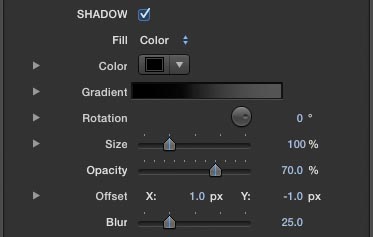
Shadow - Enable the Shadow checkbox to turn on the drop shadow effect. Note that if you are using the FCP X Text tool, the built-in FCP X Title Drop Shadow won't work, which is why it's really useful to be able to add one with this option. Use the Fill dropdown menu to determine the look of the shadow - you can select from Face Fill (which uses the current Face Fill selection, see above), Color (which enables the result of the Color swatch), Gradient (which enables the result of the user-adjustable gradient), Face Color (which uses the result of the Face Color swatch), Face Gradient (which uses the current states of the user-adjustable Face Gradient, see above), any one of the ten Face Fill presets (see above), either of the two Drop Zones sources, or finally the Effect Source image.
There are controls for adjusting the shadow Rotation, Size and Opacity, as well as its Offset (how far away it is from the main object in both X and Y directions) and Blur. Note that the rotation control will not show a result if you are solid color for the fill.
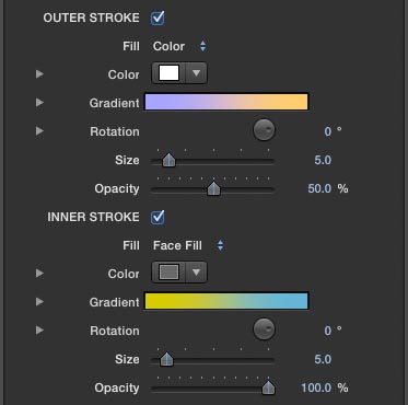
Outer & Inner Stroke - you can enable either Outer or Inner Stroke (or both) by clicking their respective checkboxes. Outer Stroke will create a stroke that starts at the edge of the object and grows outwards, whereas Inner Stroke creates a stroke that starts at the inner edge of the object and grows inwards. Note that if you are using the FCP X Text tool, the built-in FCP X Outline won't work, which is why it's really useful to be able to add these two different strokes from within Hawaiki Style.
Use the Fill dropdown menu to determine the look of the stroke - you can select from Face Fill (which uses the current Face Fill selection, see above), Color (which enables the result of the Color swatch), Gradient (which enables the result of the user-adjustable gradient), Face Color (which uses the result of the Face Color swatch), Face Gradient (which uses the current states of the user-adjustable Face Gradient, see above), any one of the ten Face Fill presets (see above), either of the two Drop Zones sources, or finally the Effect Source image.
There are controls for adjusting the glow Rotation, Size and Opacity. Note that the rotation control will not show a result if you are solid color for the fill.
One useful trick to try when you've created a design with a gradient fill for the face, is to select Face Fill for the Outer Stroke and then rotate the stroke through 180 degrees so it is vertically flipped - even using just a thin stroke can really improve the overall look of the design.
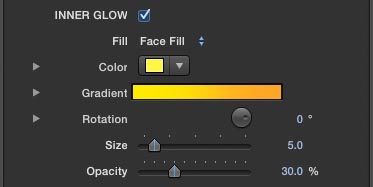
Inner Glow - enable the Inner Glow checkbox to add a glow effect that starts at the edge of the object and grows inwards.
Use the Fill dropdown menu to determine the look of the glow - you can select from Face Fill (which uses the current Face Fill selection, see above), Color (which enables the result of the Color swatch), Gradient (which enables the result of the user-adjustable gradient), Face Color (which uses the result of the Face Color swatch), Face Gradient (which uses the current states of the user-adjustable Face Gradient, see above), any one of the ten Face Fill presets (see above), either of the two Drop Zones sources, or finally the Effect Source image.
There are controls for adjusting the glow Rotation, Size and Opacity. Note that the rotation control will not show a result if you are solid color for the fill.
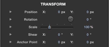
TRANSFORM
The transform section provides a full set of tools for the spatial manipulation of the finished design. As mentioned above, it is highly recommended that you create your design with your text or logo centred in the screen at the largest size possible, regardless of where it is meant to end up in order to get the best results out of the plug-in. You can then use the Transform tools to adjust the scale and position. Be aware the moving the FCP X Title object itself is not a good plan as it will change the design.
The Transform tools include XYZ Position, XYZ rotation, XYZ Scale and XY Shear, plus the ability to adjust the XY Anchor Point. This makes it more useful than the built-in FCP X transform tools which give you a more limited set of options.
DROP ZONES
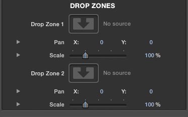
As we've seen, all the fill menu options include the ability to access one of two Drop Zones where you can add your own textures, gradients or colors for easy access within your design. If you were feeling brave and felt you could trust Apple's drop zone implementation for video sources (rather than just stills), you could even use this feature to add a moving texture to your design.
To use a drop zone, simply click on the image well, then click on the image you want to use, and then hit Apply. You can use the XY Pan controls and the XYZ Scale controls to fine tune the result.